papazero
Cosmic Treadmill Duster

Posts: 152
|
Post by papazero on May 14, 2009 14:08:21 GMT -5
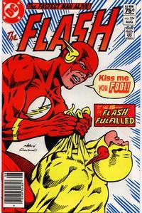
Something I've seen no mention of as of yet in regard to the rebirth of Flash is the title logo. I was excited to see the preview of the first issue before it came out but the sneak peek didn't reveal the logo. When I finally saw it on the rack I was ecstatic to see the familiar emblem in the bottom right corner. The Flash: Rebirth logo is slightly modified but undeniably reminiscent of the silver age/bronze age feel. To me, this truly said - Barry is back. I was skeptical about the revival of my favorite character but I have to admit feeling some of the same excitement I felt picking up a new Flash issue at the grocery store back when I was ten years old. Check out this Flash Logo Study by Todd Klein - Part 1 - kleinletters.com/Blog/?p=1025Part 2 - kleinletters.com/Blog/?p=1041Part 3 - kleinletters.com/Blog/?p=1055Part 4 - kleinletters.com/Blog/?p=1069 |
|
kelson
Grodd's Mind Slave
Speed Force Historian
Posts: 106
|
Post by kelson on May 20, 2009 12:28:31 GMT -5
That's a fantastic study of the logos.
Oddly enough, my favorite Flash logo is the one from Flash: The Fastest Man Alive. It manages to incorporate elements from several previous logos without getting overcomplicated. Drop the subtitle, but don't add the lightning bolt that they used for the Wally relaunch, and I think it's perfect.
|
|
|
|
Post by momoney433 on May 20, 2009 15:23:14 GMT -5
Flying hotdogs all the way;)!!
|
|
savitar
Speedster in Training
Lightning can strike twice
Posts: 59
|
Post by savitar on May 22, 2009 17:56:00 GMT -5
Never did quite like the digital-point logo.
|
|